The "Apothecary" Countertop: How to Curate Your Daily Essentials
In the world of high-end bathroom design, the greatest luxury isn't a gold faucet or a heated floor, it’s visual silence. We’ve all felt that low-level hum of anxiety that comes from a countertop cluttered with mismatched plastic bottles, neon-colored labels, and tangled hair ties. It’s the ultimate "spa-vibe" killer.
The "lightbulb moment" for your vanity this August is the transition to the Apothecary Aesthetic. This isn't about hiding your products away in a drawer where you’ll forget to use them; it’s about decanting and curating your daily essentials so they become part of the decor. By using organic materials and a cohesive color palette, you can turn your morning routine from a chore into a sensory ritual. Here is how to curate an apothecary countertop that feels intentional, grounded, and deeply luxurious.
1. The "Base Layer": The Power of the Tray
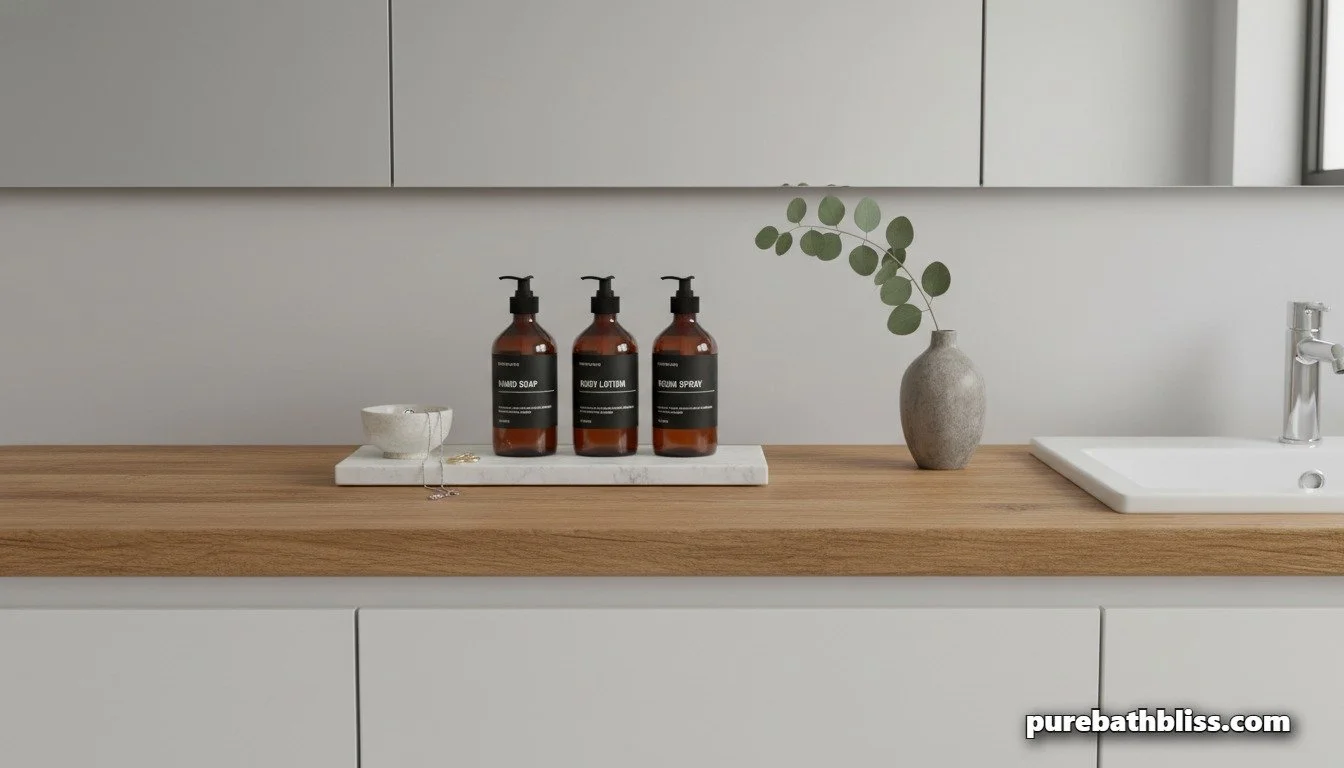
The secret to a curated countertop is containment. If you have five bottles sitting directly on your stone, they look like clutter. If you place those same five bottles on a tray, they look like a "collection."
In keeping with our warm minimalism goals, look for trays made of natural stone, honed marble, or solid walnut. The tray creates a "zone" for your products, which makes cleaning much easier. Instead of moving ten individual items to wipe down the counter, you move one tray. This fits perfectly into our 3-minute morning reset protocol.
2. Decanting into "Weighted" Materials
Plastic is for travel; glass and ceramic are for the sanctuary. The "Apothecary" look relies heavily on Amber Glass. Not only does amber glass look stunning against living finishes like unlacquered brass, but it also protects your products from the UV rays of your circadian lighting, preserving the efficacy of your serums.
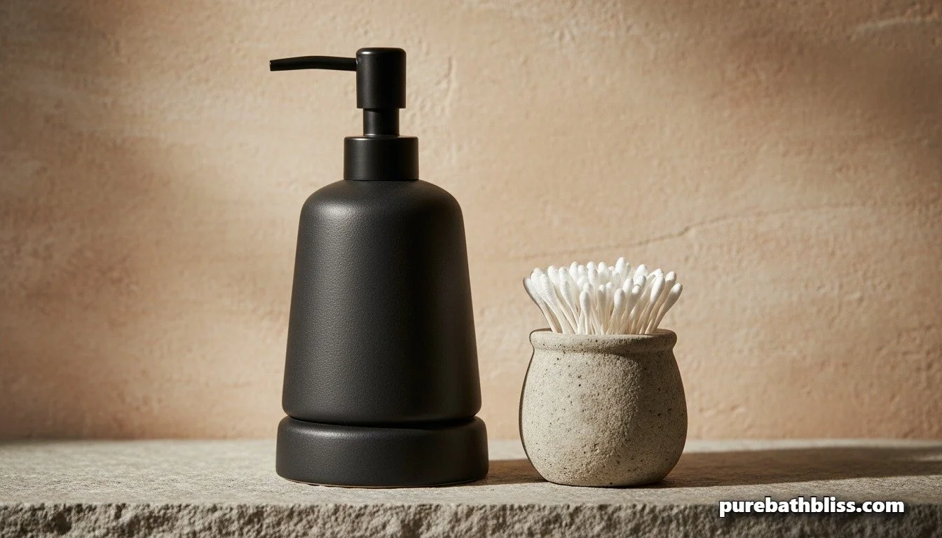
Switch your hand soap, mouthwash, and lotions into weighted glass or ceramic dispensers. The physical weight of a ceramic pump feels more "substantial" in your hand, providing a tactile signal of quality every time you use it.
3. Editing the "Label Noise"
Branding is designed to grab your attention in a grocery store aisle, but you don't want it screaming at you while you're trying to achieve emotional regulation.
The Fix: Invest in a set of uniform, waterproof labels. Use simple, sans-serif fonts that identify the contents without the marketing fluff. If you have products that can't be decanted (like certain high-end serums), turn them so the label faces the wall, or tuck them behind your taller amber bottles. This reduces "visual friction" and lets your eyes rest.
The Apothecary Curation Checklist
| Category | The Plastic Reality | The Apothecary Upgrade |
|---|---|---|
| Soap & Lotions | Clear plastic pumps; bright labels. | Amber glass or matte ceramic bottles. |
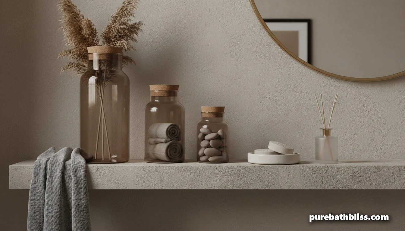
| Small Goods | Open cardboard boxes (Q-tips, etc.). | Smoked glass or stone jars with lids. |
| Organization | Items scattered across the stone. | A single "honed" marble or wooden tray. |
| Sensory Element | Synthetic air freshener spray. | A stone diffuser or a single eucalyptus branch. |
Summary: Designing for the Eyes
Your bathroom vanity is the first thing you see in the morning and the last thing you see before you begin your sleep ritual. By curating your countertop with apothecary-inspired elements, you aren't just "tidying up"—you are creating a visual sanctuary that supports your mental well-being. Ditch the plastic, embrace the glass and stone, and enjoy the quiet luxury of a curated space.