Accenting with Intention: How to Coordinate Paint with "Living" Metal Finishes
When designing an elevated bathroom sanctuary, selecting your fixtures is only half the battle. Bringing home high-end hardware like unlacquered brass, raw copper, or deep matte black is an investment in texture and character. Unlike standard, factory-sealed chrome that remains highly reflective and unchanged forever, these premium choices are known as living finishes. They possess an organic nature that oxidizes and reacts to the moisture, oxygen, and touch within your space.
The ultimate "lightbulb moment" when working with living metals is realizing that your wall color cannot just be an afterthought. Your paint acts as the literal canvas for your fixtures. If you pair a warm, shifting metal with the wrong wall undertone, the hardware can easily look muddy, neglected, or entirely lost against the background.
To help your hardware develop its rich, stunning character patina with maximum clarity, you must coordinate your palette with intention. Here is how to contrast living metals against the perfect paint backdrops to ground your overall design.
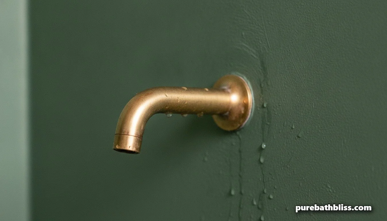
Framing Unlacquered Brass Against Cool, Earthy Moss Greens
Unlacquered brass is highly prized for its ability to evolve from a bright, golden polished tone into a deep, muted antique bronze over time. Because brass naturally holds warm, golden undertones, painting your vanity wall an equally warm yellow or beige can flatten the dynamic energy of the metal.
The Fix: Contrast the inherent warmth of unlacquered brass with a cool, earthy moss green or an understated sage. Green and gold sit beautifully opposite each other in tonal weight. The cool undertones of a chalky green wall force the brilliant golden highlights of the brass faucet to pop with intense clarity. As the brass begins to oxidize and develop its signature dark, entry-point patina, the green backdrop keeps the fixture looking highly intentional rather than tarnished. This moody, organic coupling is a staple choice when designing a modern, texturally rich color-drenched powder room.
Complementing Raw Copper with Chalky Flints and Slates
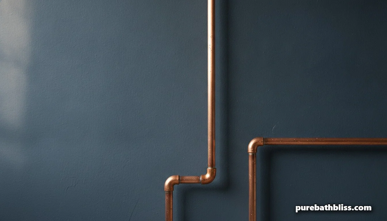
Raw copper is perhaps the most dramatic living finish available. It transitions beautifully from a bright, pennies-bright orange-pink into a complex, deep brown, eventually developing hints of powdery green verdigris if exposed to consistent moisture.
The Fix: Avoid using bright pastel walls or clean primary backdrops, which can make raw copper look industrial or out of place. Instead, isolate its fiery warmth against a chalky flint, cool charcoal, or soft slate gray.
The blue-gray undertones in slate paint create an elegant tension with the copper's orange hues. This allows the plumbing lines to read as stunning architectural art against the wall. This high-contrast grounding ensures that your space feels like a high-end custom retreat rather than a raw utility closet.
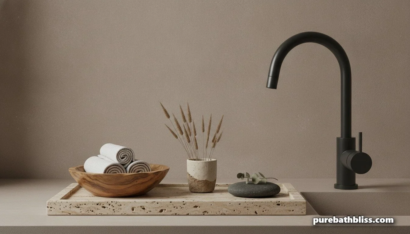
Grounding Matte Black with Complex Mineral Off-Whites
While matte black isn't technically a living finish that changes color via oxidation, it requires the exact same canvas-level planning. Because matte black absorbs 100% of the light hitting it, mounting it against a flat, standard builder-grade white wall creates a harsh, jarring contrast that can feel incredibly flat and aggressive to the eyes.
The Fix: Soften the transition by framing your matte black hardware against complex mineral off-whites that feature soft taupe or warm gray undertones. The subtle tint in a mineral off-white absorbs the stark edge of the black metal, creating a smooth, high-end "spa" environment. This intentional grounding allows your hardware to look crisp and defined while maintaining the calming, peaceful atmosphere necessary for practicing healthy sensory bathing and emotional regulation.
The Living Metal Paint Coordination Matrix
| Hardware Finish | The Organic Evolution | Ideal Paint Pairing | The Visual Result |
|---|---|---|---|
| Unlacquered Brass | Bright gold to muted, deep antique bronze. | Chalky Moss or Sage Green | Golden highlights pop against cool organic earth tones. |
| Raw Copper | Bright orange-pink to deep brown/verdigris. | Flint, Charcoal, or Slate Gray | Fiery metallic warmth stands out elegantly as art. |
| Matte Black | Unchanged (Absorbs surrounding ambient light). | Mineral Off-White or Soft Taupe | Crisp, modern definition without looking clinical or flat. |
Summary: Designing for Material Longevity
True luxury is about creating a space where materials are allowed to tell a story over time. By coordinating your wall colors to complement the shifting, natural properties of your living metals, you transform ordinary plumbing fixtures into intentional focal points. Frame your metals with the right canvas, let the finishes age gracefully, and enjoy the visual depth of a truly custom sanctuary.